- Instagram introduced a new wordmark logo on Thursday, marking the first update in 10 years.
- Instagram head Adam Mosseri announced the change on both Instagram and Threads, describing the new logo as 'sharper and more modern'.
- Public reaction to the new logo included both compliments and complaints, with many joking that it reads 'Instagzam'.
- Some critics referred to the new logo as a symbol of 'AI slop'.
- The previous wordmark felt dated after a decade in use, prompting the redesign.
- The new wordmark maintains a script style with redrawn letterforms, recalling cursive writing.
- The last significant design change occurred in 2016, when Instagram moved away from the classic brown camera logo.
Instagram has refreshed its wordmark logo for the first time in a decade, aiming for a 'cleaner and more modern' aesthetic, according to head Adam Mosseri. The new design retains a script style with redrawn letterforms, echoing the original logo while attempting to maintain simplicity.1237
The change was announced on both Instagram and Threads, where Mosseri emphasized the need for a refresh after ten years, stating, "The wordmark at the top of the app hasn't changed in 10 years, so it was time for a refresh." Despite the intention behind the redesign, reactions have been mixed. Some users appreciate the updated look, while others have humorously pointed out that the font makes it resemble 'Instagzam' due to the shape of the letter 'r.'46
Critics have also noted that the cursive-like font may not resonate with younger generations who are less familiar with cursive writing. "The ‘s’ is supposed to be a callback to the old logo’s cursive, but it feels like the random number generator grabbed a different typeface," remarked one observer.
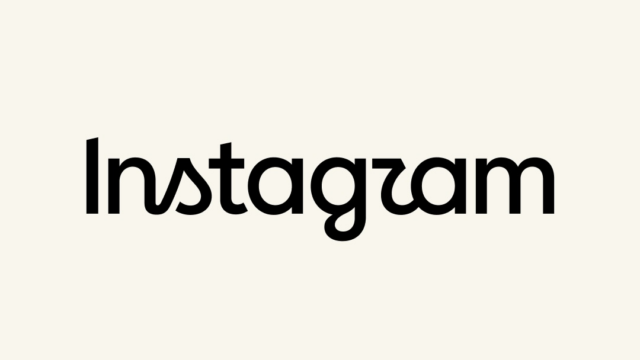
While the logo aims to reflect a modern identity, some have expressed concerns about its legibility and overall effectiveness as a brand symbol. "As a functional piece of text, I don’t think the new wordmark does a great job. It has legibility and identity problems," noted a critic. Nonetheless, the change marks a significant moment for Instagram, which last updated its design in 2016.8
“The last logo update was in 2016, when Instagram moved from the brown camera to the pink gradient icon. The new wordmark's cursive-style font, with curves on 's', 'r', and 'g', has drawn comparisons to AI-generated text, with some calling it 'unintentional genius'.”
 TechCrunch
 Ars Technica